Typography Time Tunnel
“To study street sign typefaces is to appreciate the multiple layers of a city. They represent different eras and have different functions. When you walk around the city, you see a wide variety of typefaces. For people with an eye for typography, that is an exciting kind of exploration, but it can be an overwhelming mental exercise, too. There aren’t many places like Hong Kong, which has so many stone archways from the 1960s, metal lintels with sans-serif typefaces, millennial digital fonts, and minimalist and literary styles that became popular in the 2010s. Their coexistence reflects a city’s diversity and also a mark of the passage of time.” Forrest Lau, a zine designer (zine is a non-profit independent publication), says in the prologue of Walking Map on Typography in Causeway Bay (銅鑼灣字型散步地圖).
A map for hunting treasures
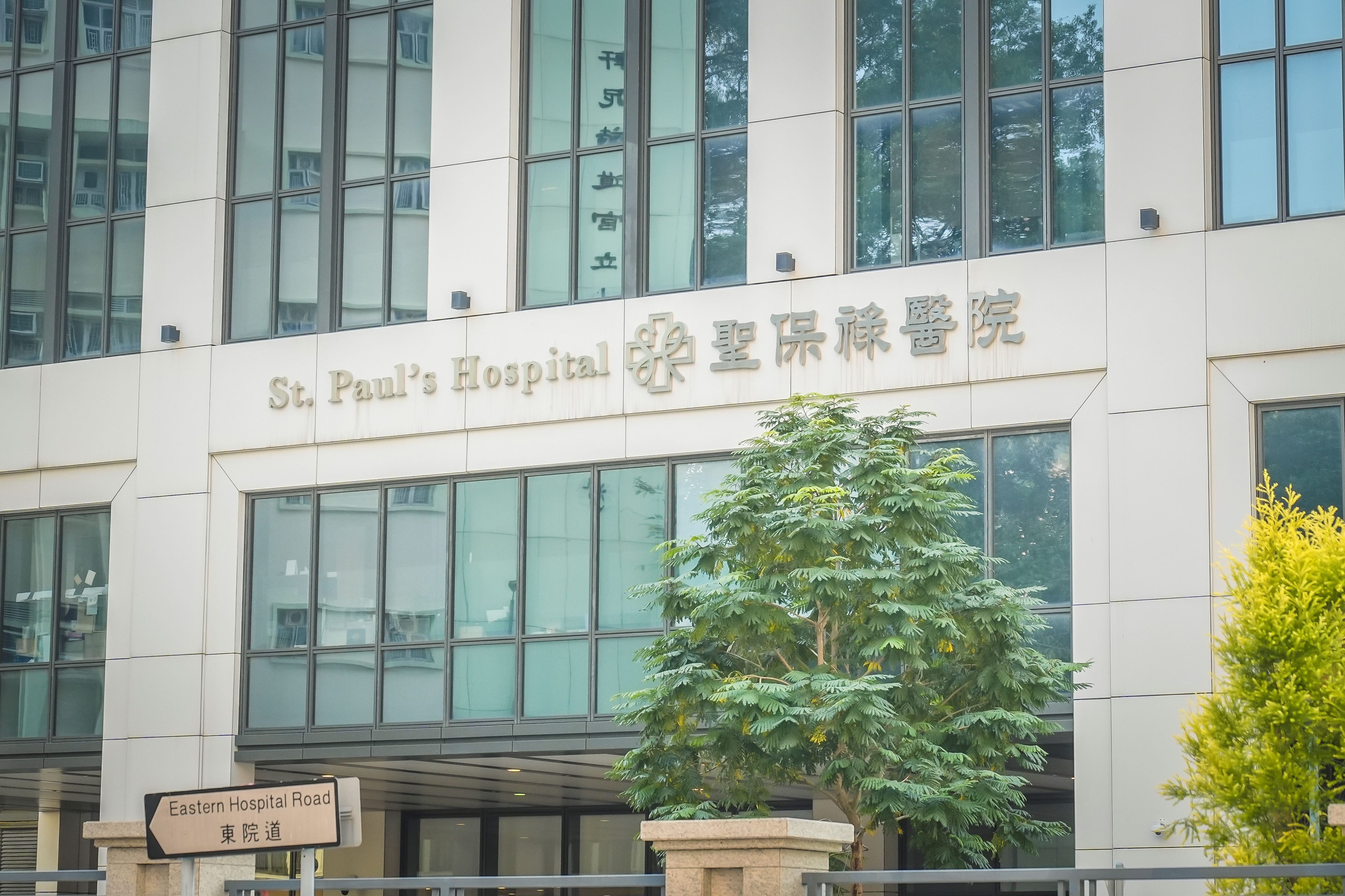
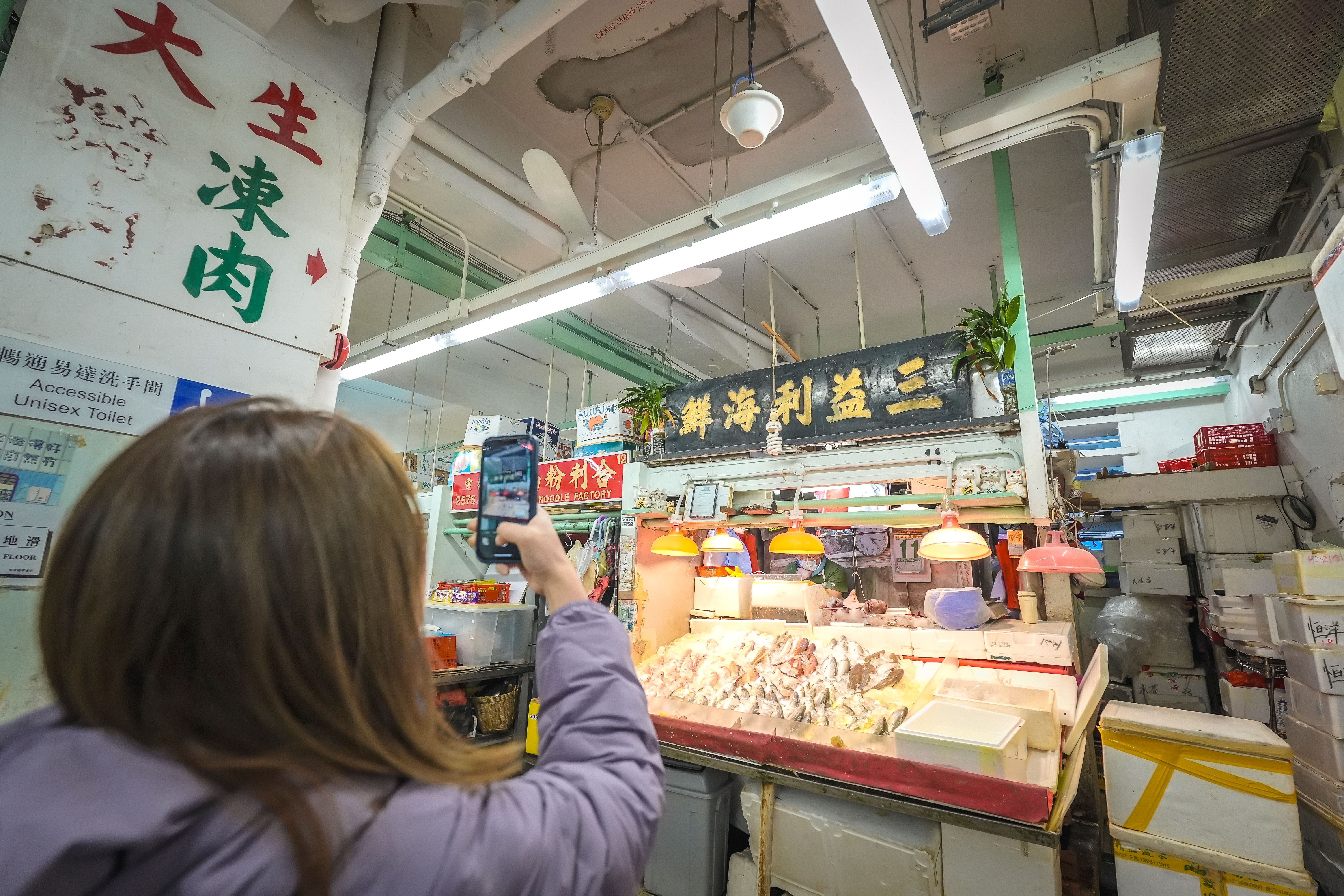
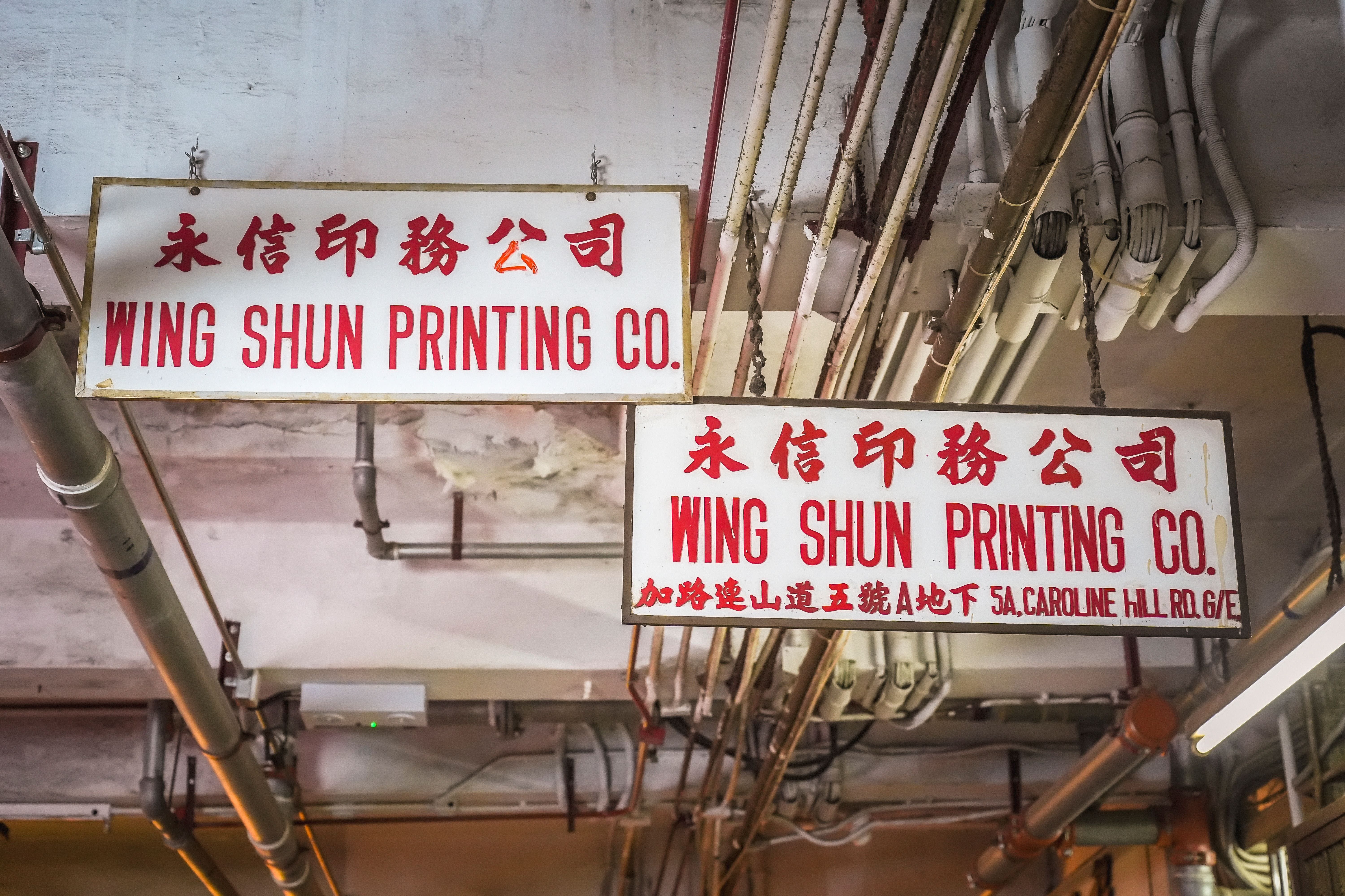
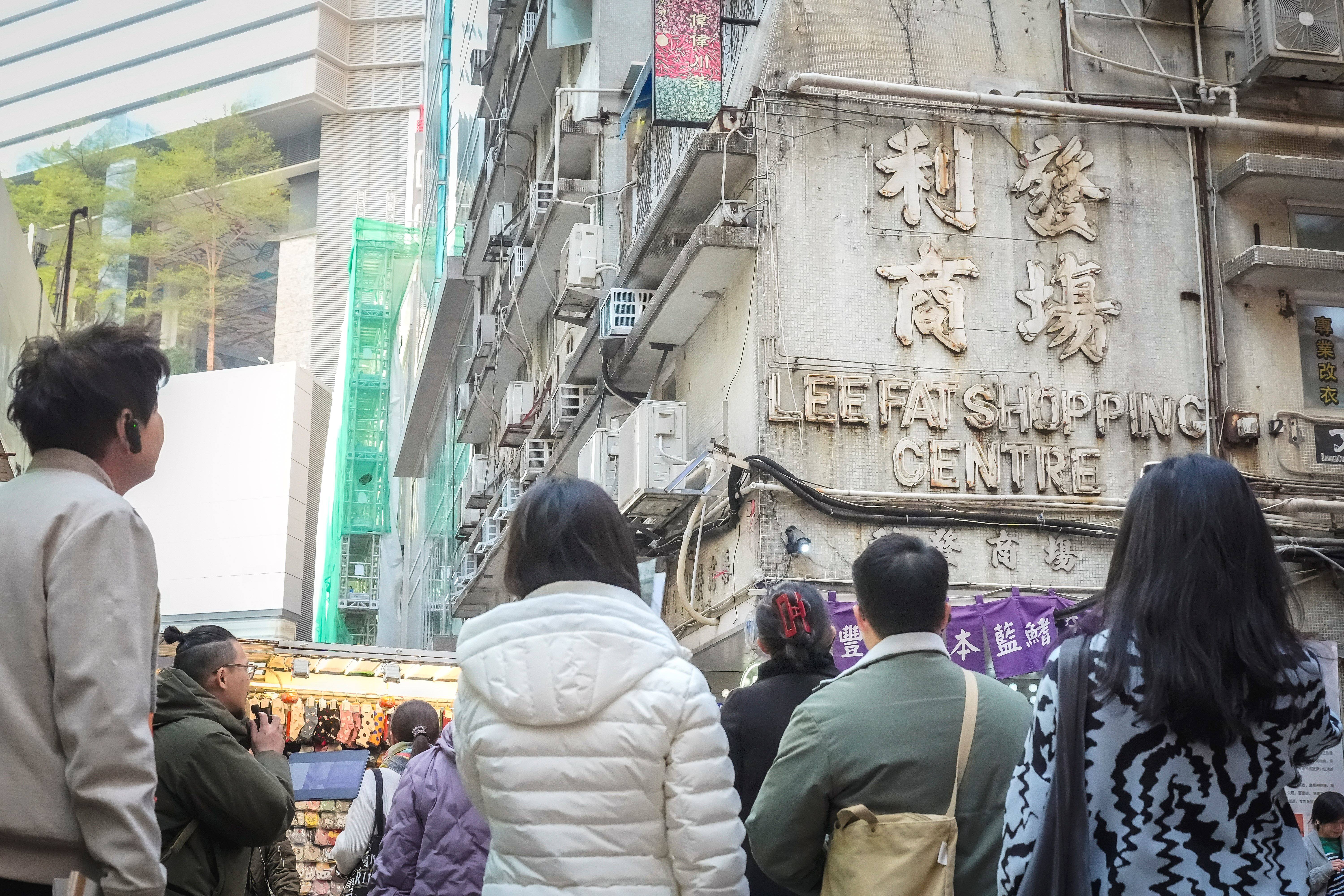
Lau has recorded interesting typefaces on the streets of Causeway Bay and compiled them into a map and a booklet. The publication vividly presents the typeface-rich streets of Causeway Bay, with a total of 72 signs and advertisements. It comes with details such as the years the typefaces were produced, materials used to create the signs, background details of the buildings or shops housing the signs, and Lau’s observations. The reader may be pleasantly surprised to find on the map such a vast array of font styles, which come in different forms and shapes. Fun digital fonts and the imposing clerical script are only one street apart, for example. Signs displayed at wet market stalls are also unique. For typography fans and history buffs, Causeway Bay is a treasure trove.
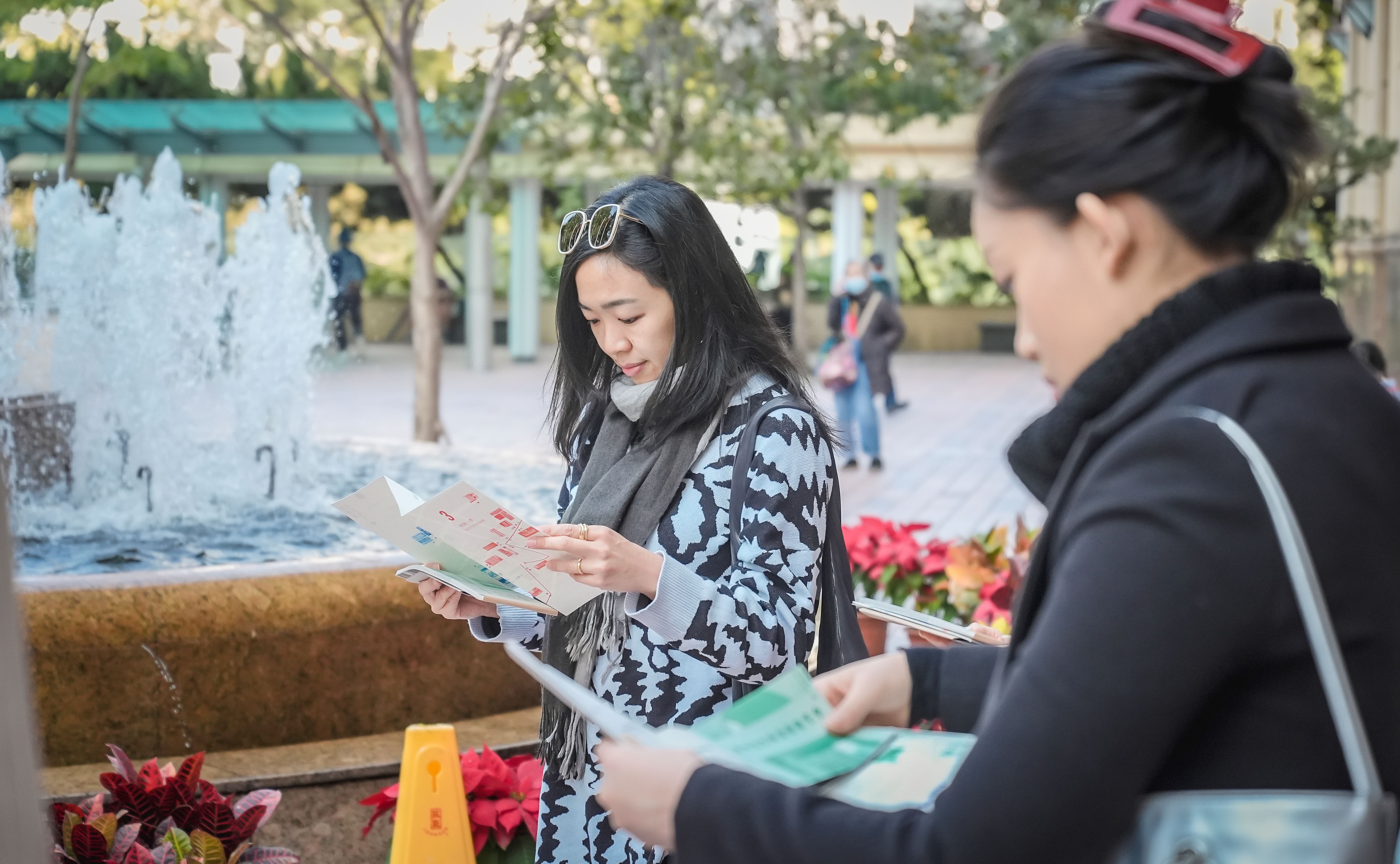
Hysan recently invited Lau to lead a typography walking tour around Causeway Bay. Through street sign typefaces, the participants saw the district from a fresh perspective. The map and booklet he produced were specially designed for the tour.
Lau explains: “There are just so many interesting typefaces in Causeway Bay. One tour is not enough to explain everything. The map and booklet have helped me organise my research materials, but they are also useful for the tour participants. One day when they revisit the area, they can use the map and booklet to explore what was not explained on the tour. They may even discover more interesting font styles and street signs themselves.”
Typefaces with history
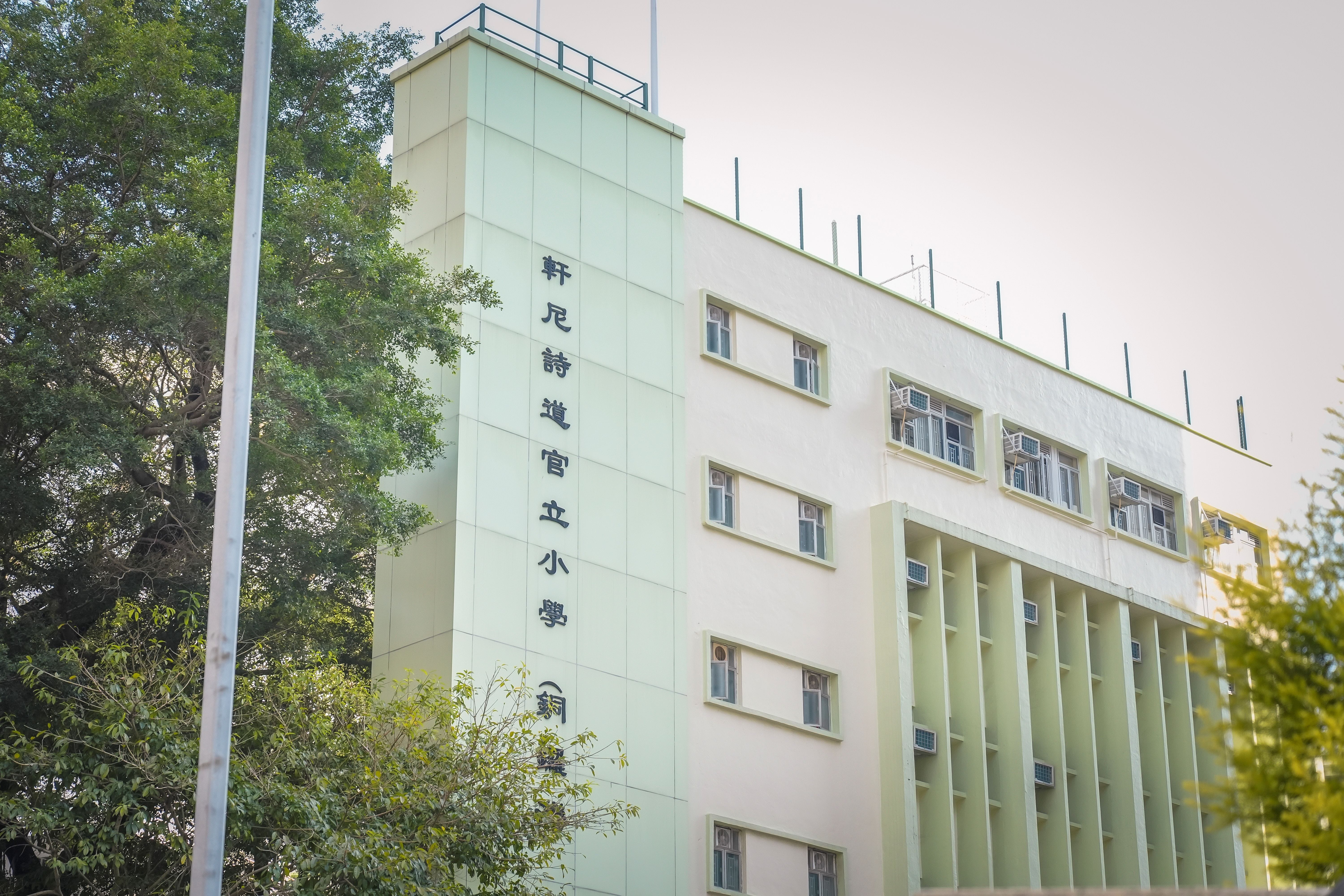
Calligraphic typefaces on street signs can be further divided into different categories. For example, large character writing (or bangshu) and yan style are both regular scripts. They may look more or less the same thing to the uninitiated. But according to Lau, there are big differences between the two. Large character writing features big, bold strokes. Chinese characters written in this style are less easy to make out than yan style, but the overall visual effect is fairly striking. Yan features rounded strokes and a squarish structure, conveying a sense of simplicity and reliability.
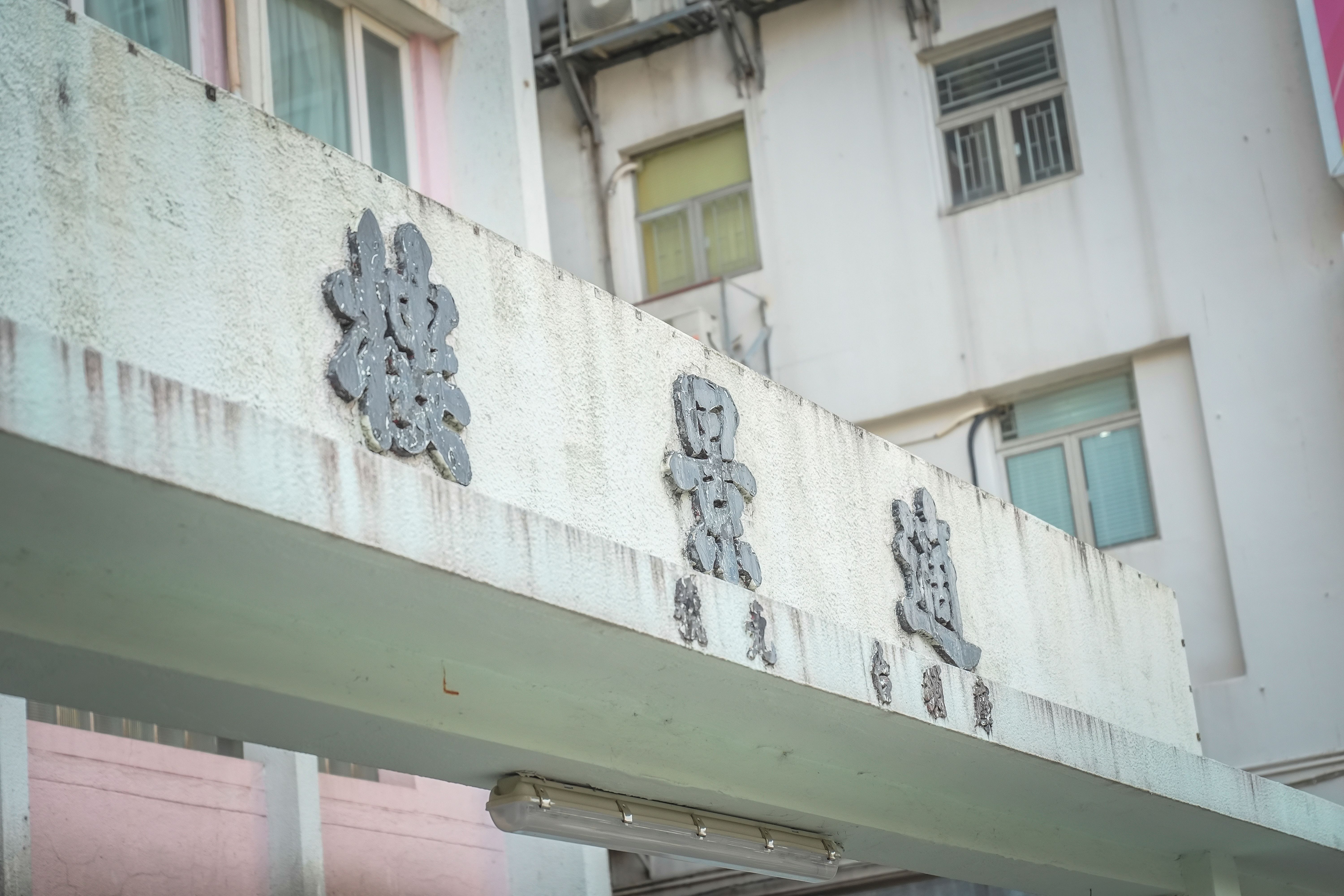
On the hillside of Caroline Hill Road, there is a cluster of five residential buildings: Caroline Hill Court, Lei Shun Court, Lei Ha Court, Lei Wen Court and Lei Ka Court. All were completed in the late 1950s. The signs fronting their main entrances are styled in a font called Beiwei. The Chinese characters are presented from right to left, and the lintels are made of terrazzo, a material fairly common in Hong Kong in the ’50s. Interestingly, the lintels at one of the two entrances to Haven Court are distinctly different from each other, indicating how time makes a difference to architectural features. One is fronted by a lintel made of metal. Metal lintels are common among Hong Kong buildings completed or renovated in the 1990s. The Chinese characters on the Haven Court lintel, read from left to right, are styled in regular script.
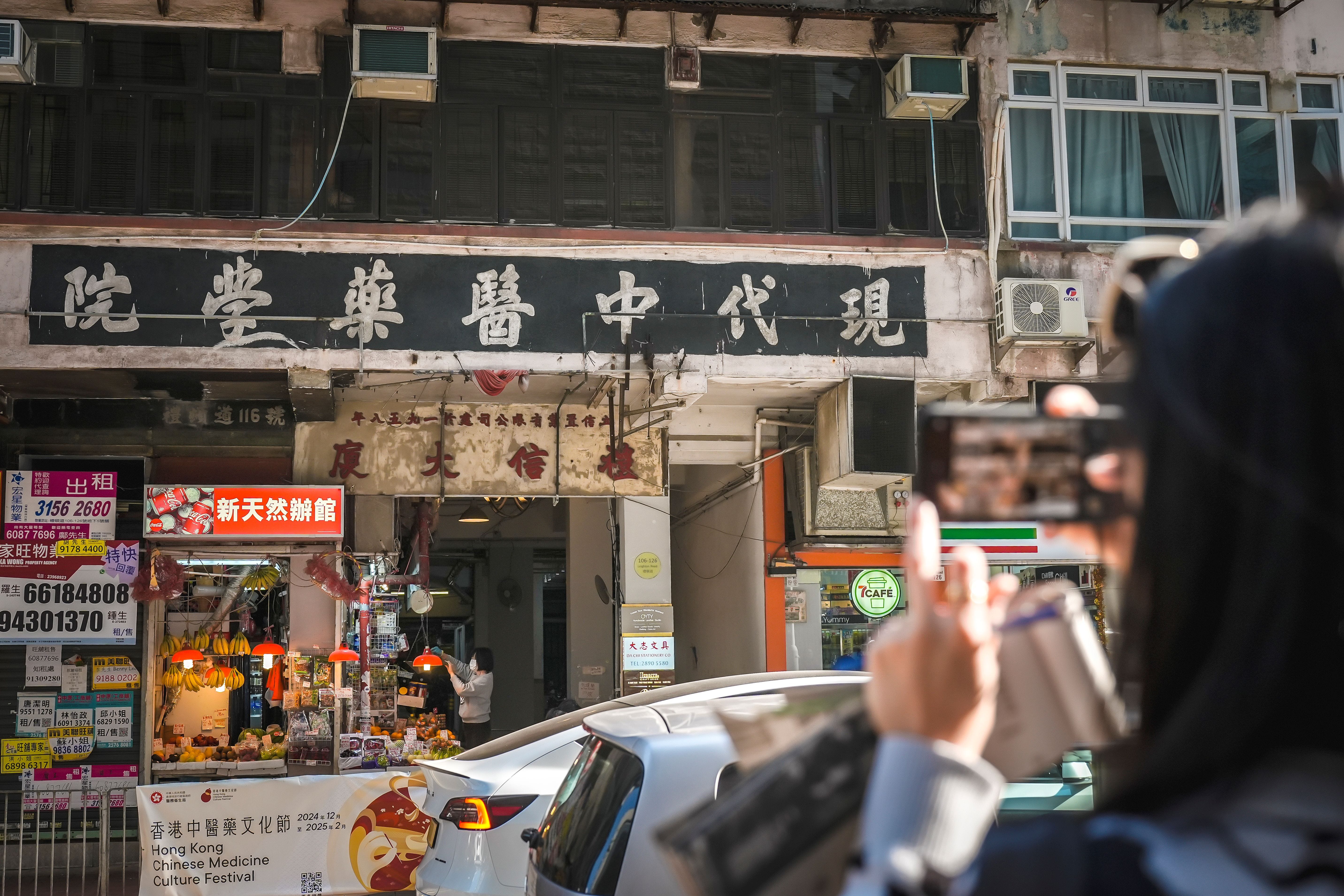
Apart from the two categories of typeface, there is another kind that cannot be easily defined or replicated. You will easily find the casual writings on Styrofoam boxes displayed at wet market stalls, and homeowners’ to-let advertisements - an economical way to achieve the landlords’ objectives. This kind of typeface is not traditionally aesthetic, but their casual and temporary nature illustrates how street landscapes are often shaped by day-to-day life’s elements. Indeed, Causeway Bay is not just a place with skyscrapers. It is also about people, and the community they form.
Lee Gardens - a fantastic place that offers a sense of belonging
Evolving over the years, Causeway Bay has borne witness to the ebb and flow of time. Yet it remains a relevant and interesting district. Keep your eyes open and you are bound to discover something new and interesting on each visit. Lee Gardens Area is committed to exploring and highlighting captivating elements within the area. Hopefully everyone visiting Lee Gardens Area can glean an understanding of its history, feel its energy, and play a part in shaping its unique urban landscape.
